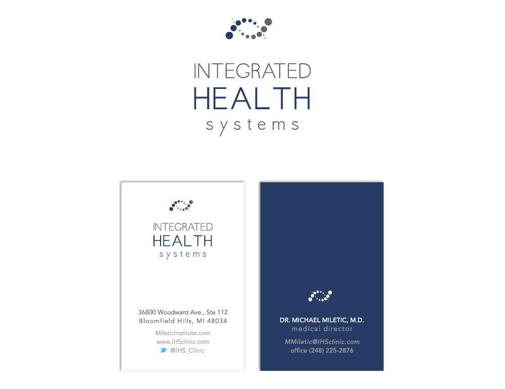
Integrated Health Systems needed a logo refresh and new business cards. The goal was to keep a simple and modern look with a professional appearance for the health industry. Bold typography paired with a simple graphic mark (provided by IHS) creates a balanced and harmonized logo as well as the base for equally balanced business cards. The color scheme keeps a professional and strong look with the use of a dark blue while balanced with a calming grey to soften it.